A few months ago we announced an improvement to the usage charts you can see in your account dashboard. Today I’m delighted to share another improvement.
Paying customers, as opposed to users on our free trial tier, have always had the ability to create and label multiple API keys for their account.
They can now toggle their usage graphs between various views - either a summary view (all keys) or a per key breakdown.
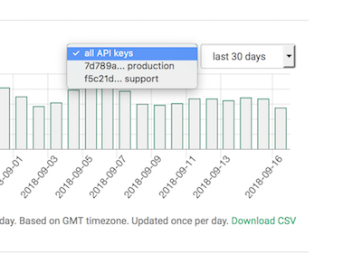
We’ve also given the charts a slight visual tweak to improve readability.
As with most of our features, we extend a big thanks to one of our customers who suggested this chance for improvement. If you have any ideas for improving our service, please let us know.
happy geocoding,